Looking for the birthday hop? Please scroll down or click HERE!
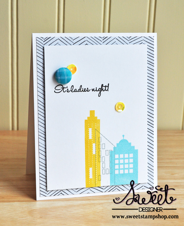
For my first card, I chose to stamp the two solid images in yellow and aqua, and the open image in gray. I then stamped my sentiment in black and added a few sequins and a brad.
I then popped up the panel on a piece of patterned paper.
For the next card, I stamped the tops of the buildings in black, then stamped the fireworks a couple of times in gold.


These are wonderful Lindsay! Awesome work! Congrats!!!
ReplyDeleteThese are both absolutely fantastic! Love them!
ReplyDeleteWow! I love these cards. The blue and yellow cityscape is fantastic!
ReplyDeleteBeautiful cards. Wonderful way of laying everything out. Awesome job.
ReplyDeleteGreat CAS designs with this set.
ReplyDeleteYour cityscape cards are FABULOUS!!!! Love the colors!
ReplyDeleteI like how you bring the color in with the button, etc. Nice.
ReplyDeleteLove these cards but especially the first one. Love those building stamps!!
ReplyDeleteI love these! Wonderful stamping and I love embellishment choices!
ReplyDeleteLove your style! These cards are just great!
ReplyDeletelove love your stamping on these, Lindsay! fabulous work as always!
ReplyDeletegreat cards!
ReplyDeleteLOVE THEM!
ReplyDeleteBoth cards are fantastic! Love all the white space!
ReplyDeleteCute, cute, CUTE, Lindsay! LOVE the font and epoxy dots, and the city scapes are perfect... so trendy right now!
ReplyDeleteOh wow! These turned out sooo cute!
ReplyDeleteThese are awesome, Lindsay! Love the graphic look of those city buildings and the pops of yellow on both!
ReplyDelete